
Design
Responsive Web Design
One site, every screen
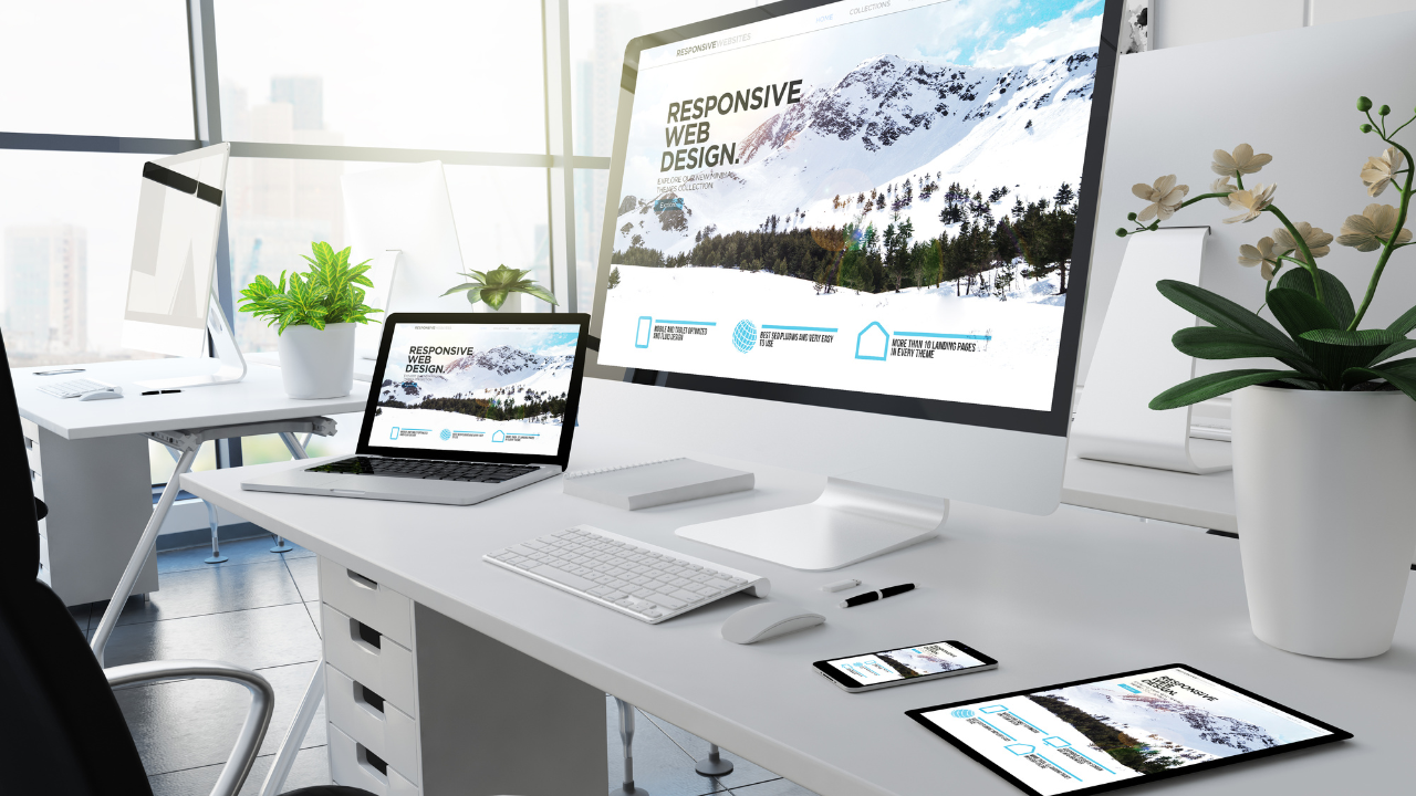
We design and build websites that adapt cleanly from a 5-inch phone to a 32-inch monitor, tested across real devices — not just a resized browser window.
मुख्य विशेषताएं
Mobile-first responsive layouts
Cross-device & cross-browser testing
Performance-tuned breakpoints
Accessible, touch-friendly interactions
कोई प्रोजेक्ट सोच रहे हैं?
बताइए आप क्या बनाना चाहते हैं — हम एक कार्यदिवस के भीतर आपसे संपर्क करेंगे।