

Design
Responsive Web Design
One site, every screen
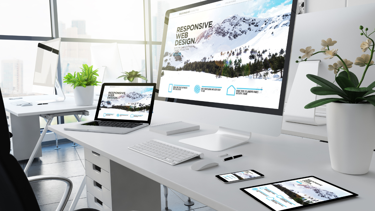
We design and build websites that adapt cleanly from a 5-inch phone to a 32-inch monitor, tested across real devices — not just a resized browser window.
Características Clave
Mobile-first responsive layouts
Cross-device & cross-browser testing
Performance-tuned breakpoints
Accessible, touch-friendly interactions
¿Tienes un proyecto en mente?
Cuéntanos qué estás construyendo — te responderemos dentro de un día hábil.